Architecture
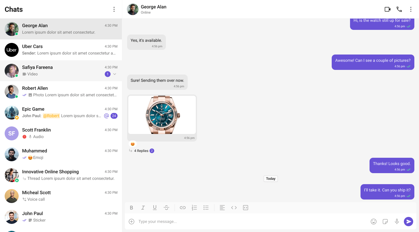
The UI Kit provides a set of independent, composable React components that wire together into complete chat layouts. A typical two-panel layout uses four core components:- CometChatConversations — sidebar listing recent conversations
- CometChatMessageHeader — toolbar showing avatar, name, status, and typing indicator
- CometChatMessageList — scrollable message feed with reactions, receipts, and threads
- CometChatMessageComposer — rich text input with attachments, mentions, and voice notes
CometChat.User or CometChat.Group object. Pass that object as a prop (user or group) to the message components. They handle SDK calls internally — the composer sends messages, the list receives them via real-time listeners.
All components must be rendered inside a <CometChatProvider> which provides shared context (theme, locale, events). SDK initialization and login must be completed before the provider mounts.
Flat API
All components — both feature and base — support the flat API. Render them in a single line with props, and they handle their layout internally.Compound Composition
For full layout control, use the compound pattern. Each feature component is a namespace with sub-components:- Root initializes state, fetches data, and provides context to children.
- Sub-components read from context and render when their state is active.
- Omit a sub-component to hide it, no boolean props needed.
- Add custom elements anywhere inside Root alongside the sub-components.
Component Categories
Components are organized into three categories:Feature Components
Feature components integrate with the CometChat SDK for data fetching, real-time events, and state management. They follow the compound pattern and support both flat and compound APIs. Feature components:- Own their data lifecycle (fetch, paginate, refresh)
- Subscribe to real-time SDK events (new messages, presence changes, typing indicators)
- Manage complex state via hooks and reducers
- Provide context to their sub-components
Base Components
Base components are pure UI building blocks with no SDK integration. They accept props and render UI — no network calls, no real-time events. Feature components compose these internally. Base components support both flat API and compound composition.Feature Components
All feature components are imported from@cometchat/chat-uikit-react.
Conversations and Lists
| Component | Purpose | Page |
|---|---|---|
CometChatConversations | Scrollable list of recent conversations with real-time updates | Conversations |
CometChatUsers | Searchable list of users with selection support | Users |
CometChatGroups | Searchable list of groups with selection support | Groups |
CometChatGroupMembers | List of group members with role-based actions | Group Members |
Messages
| Component | Purpose | Page |
|---|---|---|
CometChatMessageHeader | Toolbar with avatar, name, status, typing indicator, and call buttons | Message Header |
CometChatMessageList | Scrollable message feed with plugin-based bubble rendering | Message List |
CometChatMessageComposer | Rich text input with attachments, emoji, voice recording, and formatting | Message Composer |
CometChatMessageBubble | Message bubble container with alignment, receipts, options, and reactions | Message Bubble |
CometChatThreadHeader | Parent message bubble and reply count for threaded conversations | Thread Header |
CometChatMessageInformation | Message delivery and read receipt details panel | Message Information |
CometChatReactions | Reaction chips bar with reactor list popover | Reactions |
CometChatReactionList | Full reactor list with tabs and pagination | Reaction List |
CometChatFlagMessageDialog | Modal dialog for reporting/flagging messages with reason selection | Flag Message Dialog |
Message Bubbles
Message bubble components accept amessage object and self-extract all required data (text, attachments, metadata, sender info). Unlike v6 where bubbles were purely presentational, v7 bubbles are self-contained — they derive their rendering state directly from the SDK message.
| Component | Message Type | Purpose | Page |
|---|---|---|---|
CometChatTextBubble | text | Formatted text with mentions, URLs, markdown, and link previews | Text Bubble |
CometChatImageBubble | image | Image grid with captions and click-to-fullscreen | Image Bubble |
CometChatVideoBubble | video | Video player with thumbnail and caption | Video Bubble |
CometChatAudioBubble | audio | Waveform audio player with caption | Audio Bubble |
CometChatFileBubble | file | File card with name, size, and download button | File Bubble |
CometChatPollBubble | extension_poll | Poll with options, voting, and results | Poll Bubble |
CometChatStickerBubble | extension_sticker | Sticker image display | Sticker Bubble |
CometChatCollaborativeDocumentBubble | extension_document | Document collaboration link with join button | Collaborative Document Bubble |
CometChatCollaborativeWhiteboardBubble | extension_whiteboard | Whiteboard collaboration link with join button | Collaborative Whiteboard Bubble |
CometChatGroupActionBubble | groupMember | Group membership system messages (joined, left, kicked, banned, scope change) | Group Action Bubble |
CometChatCallActionBubble | audio, video (call category) | Call status system messages (missed, outgoing, incoming, ended) | Call Action Bubble |
CometChatCallBubble | meeting (custom) | Direct call / meeting invitation bubble | Call Bubble |
Calling
| Component | Purpose | Page |
|---|---|---|
CometChatCallButtons | Voice and video call initiation buttons | Call Buttons |
CometChatIncomingCall | Incoming call notification with accept/decline | Incoming Call |
CometChatOutgoingCall | Outgoing call screen with cancel control | Outgoing Call |
CometChatCallLogs | Scrollable list of call history | Call Logs |
Search and AI
| Component | Purpose | Page |
|---|---|---|
CometChatSearch | Unified search across conversations and messages | Search |
CometChatAIAssistantChat | AI agent chat with streaming, suggestions, and history | AI Assistant |
Base Components
Base components are imported from@cometchat/chat-uikit-react. They don’t have individual doc pages — use the source types and Storybook for reference.
| Component | Purpose |
|---|---|
CometChatActionBubble | Reusable pill-shaped system message bubble (used by GroupActionBubble and CallActionBubble) |
CometChatActionSheet | Bottom sheet with grouped action items |
CometChatAvatar | User/group avatar with image and initials fallback |
CometChatButton | Styled button with icon, text, loading, and variant support |
CometChatChangeScope | Group member role/scope change selector |
CometChatCheckbox | Checkbox input with label and controlled/uncontrolled support |
CometChatConfirmDialog | Confirmation dialog with customizable message and buttons |
CometChatContextMenu | Options menu with top-row icons and overflow dropdown |
CometChatConversationStarter | AI-generated conversation starter suggestions as clickable pills |
CometChatConversationSummary | AI-generated conversation summary display |
CometChatDate | Formatted date/time display with temporal bucketing |
CometChatDeleteBubble | ”This message was deleted” placeholder bubble |
CometChatDownloadButton | Download button for file and media attachments |
CometChatEmojiKeyboard | Emoji picker with category tabs and search |
CometChatErrorBoundary | Error isolation wrapper with fallback UI and retry |
CometChatFormattingToolbar | Rich text formatting toolbar (bold, italic, lists, links, code) |
CometChatFullScreenViewer | Full-screen image/media viewer with download |
CometChatLinkDialog | Dialog for inserting or editing hyperlinks |
CometChatLinkPopover | Popover for previewing and editing links inline |
CometChatListItem | Standardized list item with avatar, title, subtitle, and tail |
CometChatMediaRecorder | Audio recording with timer, preview, and submit |
CometChatModerationView | Content moderation indicator and action view |
CometChatPopover | Positioning utility component for popovers and dropdowns |
CometChatRadioButton | Radio button input with label support |
CometChatSearchBar | Search input with clear button and keyboard handling |
CometChatSmartReplies | AI-powered reply suggestions as clickable chips |
CometChatThreadView | Inline thread reply indicator with reply count and unread dot |
CometChatToast | Toast notification for transient feedback messages |
CometChatTypingIndicator | Animated typing indicator with user attribution |
Component API Pattern
All components share a consistent API surface for customization.Actions (Callbacks)
Callback props fire on user interactions. Override them to customize behavior:Filters (RequestBuilder)
List components acceptRequestBuilder props to control which data loads:
.build().
View Props
View props replace the visual content inside a component slot while keeping the default behavior wired:CSS Styling
Components use CSS custom properties (design tokens). Override them on the.cometchat root or on component-specific selectors:
.cometchat-component-name__element--modifier.
Next Steps
Theming
Customize colors, fonts, and spacing with CSS variables
Plugins
Customize message rendering with the plugin system
Event System
Subscribe to real-time events across components
Guides
Task-oriented tutorials for common patterns