AI Integration Quick Reference
AI Integration Quick Reference
Overview
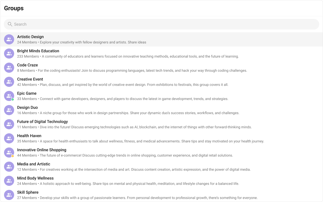
CometChatGroups is a list component that renders all available groups in the app. It emits the selected CometChat.Group via onItemClick. Wire it to CometChatMessages or use it as a group picker in flows like “join group” or “group details.”
Live Preview — interact with the default groups list.Open in Storybook ↗
The component handles:
- Paginated fetching with infinite scroll
- Real-time membership updates (joins, leaves, kicks, bans)
- Search filtering
- Swipe/hover options
- Selection mode (single/multiple)
Usage
Flat API
Compound Composition
Full Layout Example
Filtering
Pass aCometChat.GroupsRequestBuilder to groupsRequestBuilder to control which groups load. Pass the builder instance — not the result of .build(). Refer to GroupsRequestBuilder for the full builder API.
Search
The component includes a built-in search bar. When the user types, it fetches matching groups from the server. For custom search behavior, pass asearchRequestBuilder:
Filter Recipes
| Recipe | Code |
|---|---|
| Only joined groups | new CometChat.GroupsRequestBuilder().joinedOnly(true) |
| Only public groups | new CometChat.GroupsRequestBuilder().setType("public") |
| Only private groups | new CometChat.GroupsRequestBuilder().setType("private") |
| Limit page size | new CometChat.GroupsRequestBuilder().setLimit(10) |
| With tags | new CometChat.GroupsRequestBuilder().setTags(["team"]) |
Actions and Events
Callback Props
| Prop | Signature | Fires when |
|---|---|---|
onItemClick | (group: CometChat.Group) => void | User clicks a group item |
onSelect | (group: CometChat.Group, selected: boolean) => void | Group selected/deselected (selection mode) |
onError | ((error: CometChat.CometChatException) => void) | null | SDK error occurs |
onEmpty | () => void | List is empty after initial fetch |
Events Emitted
This component does not emit any UI events.Events Received
UI events this component subscribes to (published by other components):| Event | Payload | Behavior |
|---|---|---|
ui:group/created | { group } | Adds the new group to the list |
ui:group/deleted | { group } | Removes the group from the list |
ui:group/left | { group } | Removes (private) or updates (public) the group |
ui:group/member-joined | { joinedGroup } | Updates the group (member count) |
ui:group/member-added | { group, members, messages } | Updates the group |
ui:group/member-kicked | { group, user, message } | Updates the group |
ui:group/member-banned | { group, user, message } | Updates the group |
ui:group/member-scope-changed | { group, user, newScope } | Updates the group |
ui:group/ownership-changed | { group, newOwner, previousOwnerUid } | Updates the group |
SDK Listeners (Automatic)
These SDK listeners are attached internally. The component updates its state automatically — no manual subscription needed:- Groups:
onGroupMemberJoined,onGroupMemberLeft,onGroupMemberKicked,onGroupMemberBanned,onMemberAddedToGroup
Customization
View Props
Use view props to replace sections of the default UI while keeping the component’s behavior intact:| Slot | Signature | Replaces |
|---|---|---|
itemView | (group) => ReactNode | Entire group row |
leadingView | (group) => ReactNode | Avatar section |
titleView | (group) => ReactNode | Group name |
subtitleView | (group) => ReactNode | Member count / description |
trailingView | (group) => ReactNode | Trailing content (group type icon) |
headerView | ReactNode | Header area |
loadingView | ReactNode | Loading shimmer |
emptyView | ReactNode | Empty state |
errorView | ReactNode | Error state |
itemView
Replace the entire list item row. Default: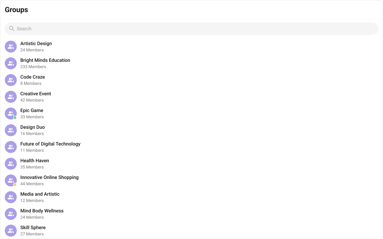
- TypeScript
- CSS
titleView
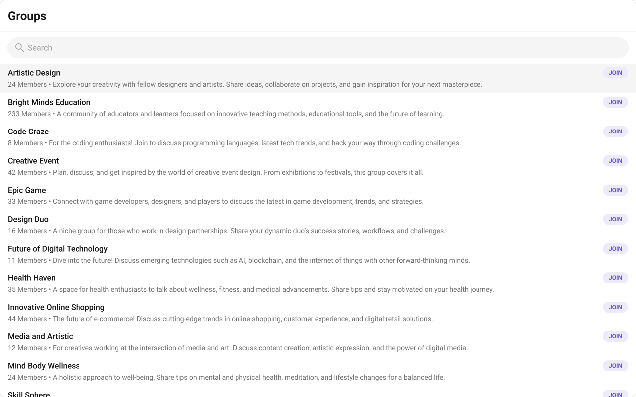
Replace the name / title text. Group type badge inline example.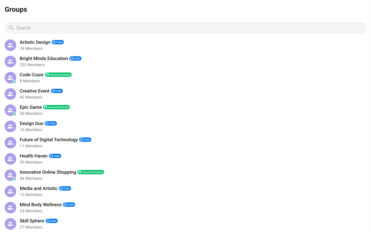
- TypeScript
- CSS
subtitleView
Replace the member count subtitle text. Default:
- TypeScript
- CSS
Compound Composition
For full layout control, use sub-components. Omit any sub-component to hide it:| Sub-component | Description | Props | Flat API equivalent |
|---|---|---|---|
Root | Context provider and container | All Root props + children | — |
List | Scrollable group list | itemView | itemView |
Item | Individual group row | leadingView, titleView, subtitleView, trailingView | Per-item view props |
Header | Header area | title, children | headerView |
SearchBar | Search input | placeholder | — |
EmptyState | Empty state | children | emptyView |
ErrorState | Error state | children | errorView |
LoadingState | Loading shimmer | children | loadingView |
CSS Styling
Override design tokens on the component selector:Props
All props are optional.View slot props (
headerView, loadingView, emptyView, errorView, itemView, leadingView, titleView, subtitleView, trailingView) are convenience props available only on the flat API. The search input is the SearchBar sub-component (with a placeholder prop), not a view slot. In compound composition mode, use the corresponding sub-components directly.groupsRequestBuilder
Custom request builder for fetching groups. Controls pagination, filtering, and sorting.| Type | CometChat.GroupsRequestBuilder |
| Default | SDK default (limit 30) |
searchRequestBuilder
Custom request builder used specifically when the user searches. Separate from the main builder.| Type | CometChat.GroupsRequestBuilder |
| Default | undefined |
searchKeyword
Initial search keyword to pre-filter groups on mount.| Type | string |
| Default | undefined |
hideGroupType
Hide the group type indicator (public/private/password-protected) on group items.| Type | boolean |
| Default | false |
hideSearch
Hide the search bar entirely.| Type | boolean |
| Default | false |
showScrollbar
Show the native scrollbar on the group list.| Type | boolean |
| Default | false |
selectionMode
Enable selection mode for single or multi-select operations.| Type | 'none' | 'single' | 'multiple' |
| Default | 'none' |
activeGroup
The currently active/highlighted group. The matching item receives an active visual state.| Type | CometChat.Group |
| Default | undefined |
options
Function that returns context menu options for each group item (shown on hover/swipe).| Type | (group: CometChat.Group) => CometChatGroupOption[] |
| Default | undefined |
onItemClick
Callback when a group item is clicked.| Type | (group: CometChat.Group) => void |
| Default | undefined |
onSelect
Callback when a group is selected or deselected (only fires in selection mode).| Type | (group: CometChat.Group, selected: boolean) => void |
| Default | undefined |
onError
Callback when an SDK error occurs during fetch or real-time operations.| Type | ((error: CometChat.CometChatException) => void) | null |
| Default | null |
onEmpty
Callback when the group list is empty after the initial fetch completes.| Type | () => void |
| Default | undefined |
CSS Selectors
| Target | Selector |
|---|---|
| Root container | .cometchat-groups |
| Header | .cometchat-groups__header |
| Search bar | .cometchat-groups__search-bar |
| List container | .cometchat-groups__list |
| Group item | .cometchat-groups__item |
| Active item | .cometchat-groups__item--active |
| Empty state | .cometchat-groups__empty-state |
| Error state | .cometchat-groups__error-state |
| Loading state | .cometchat-groups__loading-state |
Next Steps
Group Members
View and manage members of a group
Conversations
View recent conversations including group chats
Message List
Display messages for the selected group
Theming
Customize colors, fonts, and spacing