AI Integration Quick Reference
AI Integration Quick Reference
Overview
CometChatMessageComposer is a rich text input component for sending messages. It supports attachments, emoji, voice recording, mentions, rich text formatting, and reply/edit previews. Wire it alongside CometChatMessageList and CometChatMessageHeader to build a complete messaging experience.
Live Preview — interact with the default message composer.Open in Storybook ↗
The component handles:
- Text input with placeholder and auto-resize
- Rich text formatting (bold, italic, links, code, lists)
- File attachments with preview thumbnails
- Emoji keyboard
- Voice recording
- @mentions with user/group member search
- Edit and reply mode with preview banners
- Typing indicator events
- Live reactions
Usage
Flat API
Compound Composition
Full Layout Example
Actions and Events
Callback Props
| Prop | Signature | Fires when |
|---|---|---|
onSendButtonClick | (message: CometChat.BaseMessage, mode?: 'send' | 'edit') => void | Message is sent or edited |
onTextChange | (text: string) => void | Text content changes |
onError | (error: unknown) => void | An error occurs |
onClosePreview | () => void | Reply/edit preview is closed |
onAttachmentAdded | (file: File) => void | File attachment is added |
onAttachmentRemoved | (file: File) => void | File attachment is removed |
onMentionSelected | (user: CometChat.User | CometChat.GroupMember) => void | A mention is selected from suggestions |
Events Emitted
UI events this component publishes:| Event | Payload | Fires when |
|---|---|---|
ui:message/sent | { message, status } | Message sent (inprogress → success/error) |
ui:compose/edit | { message, status } | Message edit (inprogress → success/error/cancelled) |
ui:compose/reply | { message, status } | Reply context set/cleared |
ui:compose/recording-started | { composerInstanceId } | Voice recording started (stops other instances) |
Events Received
UI events this component subscribes to (published by other components):| Event | Payload | Behavior |
|---|---|---|
ui:compose/edit | { message, status: 'inprogress' } | Enters edit mode for the message |
ui:compose/reply | { message, status: 'inprogress' } | Sets reply-to message |
ui:compose/text | { text } | Sets the composer text programmatically |
ui:compose/recording-started | { composerInstanceId } | Stops own recording if another instance started |
SDK Listeners (Automatic)
The composer does not subscribe to SDK listeners directly. It relies on typing indicator events emitted via the SDK whendisableTypingEvents is false.
Customization
View Props
Use view props to replace sections of the default UI while keeping the component’s behavior intact:| Slot | Type | Replaces |
|---|---|---|
attachmentButtonIconView | ReactNode | Icon inside the attachment button |
voiceRecordingButtonIconView | ReactNode | Icon inside the voice recording button |
emojiButtonIconView | ReactNode | Icon inside the emoji button |
sendButtonView | ReactNode | Content inside the send button |
auxiliaryButtonView | ReactNode | Additional buttons in the actions area |
headerView | ReactNode | Header area above the input |
attachmentOptions
Override the default attachment options.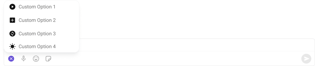
auxiliaryButtonView
Replace the auxiliary button area.
sendButtonView
Replace the send button.
Compound Composition
For full layout control, use sub-components. Omit any sub-component to hide it:| Sub-component | Description | Props | Flat API equivalent |
|---|---|---|---|
Root | Context provider and container | All Root props + children | — |
Input | Text input area | className | — |
SendButton | Send/edit button | children, className | sendButtonView (as children) |
AttachmentButton | Attachment picker | hideOptions, className | attachmentButtonIconView |
EmojiButton | Emoji keyboard toggle | className | emojiButtonIconView |
VoiceButton | Voice recording toggle | className | voiceRecordingButtonIconView |
EditPreview | Edit mode preview banner | className | — |
ReplyPreview | Reply mode preview banner | className | — |
AuxiliaryButtons | Custom auxiliary buttons | children, className | auxiliaryButtonView |
AIButton | AI features toggle | className | — |
Header | Header area | children, className | headerView |
Footer | Footer area | children, className | — |
CSS Styling
Override design tokens on the component selector:Props
All props are optional unless noted.View slot props (
headerView, sendButtonView, auxiliaryButtonView, attachmentButtonIconView, voiceRecordingButtonIconView, emojiButtonIconView) are convenience props available only on the flat API. In compound composition mode, use the corresponding sub-components directly or pass children to them.Entity
user
User for 1:1 conversations.| Type | CometChat.User |
| Default | undefined |
group
Group for group conversations.| Type | CometChat.Group |
| Default | undefined |
parentMessageId
Parent message ID for threaded replies.| Type | number |
| Default | undefined |
Layout
layout
Layout mode for the composer.compact keeps everything on one line; multiline expands the input area.
| Type | 'compact' | 'multiline' |
| Default | 'compact' |
Text Input
initialText
Initial text to pre-fill the input (uncontrolled).| Type | string |
| Default | undefined |
text
Controlled text value. When provided, the consumer owns the text state and must update it viaonTextChange.
| Type | string |
| Default | undefined |
placeholder
Placeholder text shown when the input is empty.| Type | string |
| Default | 'Type a message...' |
enterKeyBehavior
What happens when the user presses Enter.| Type | 'send' | 'newline' | 'none' |
| Default | 'send' |
maxInputHeight
Maximum height for the input area in pixels before it scrolls.| Type | number |
| Default | 200 |
Rich Text
enableRichTextEditor
Enable rich text formatting (toolbar, keyboard shortcuts, markdown auto-conversion).| Type | boolean |
| Default | false |
hideRichTextFormattingOptions
Hide the rich text formatting toolbar (shortcuts still work).| Type | boolean |
| Default | false |
showBubbleMenuOnSelection
Show a floating bubble menu near selected text with formatting options (desktop only).| Type | boolean |
| Default | false |
Edit / Reply
messageToEdit
Message to edit (triggers edit mode).| Type | CometChat.TextMessage | null |
| Default | null |
messageToReply
Message to reply to (triggers reply mode with preview).| Type | CometChat.BaseMessage | null |
| Default | null |
Attachments
attachmentOptions
Custom attachment options (overrides plugin-provided ones).| Type | CometChatComposerAttachmentOption[] |
| Default | undefined |
hideAttachmentOptions
Hide specific attachment options in the default layout.| Type | CometChatAttachmentHideOptions |
| Default | undefined |
showAttachmentPreview
Whether to show attachment preview thumbnails before sending.| Type | boolean |
| Default | true |
maxAttachments
Maximum number of attachments allowed.| Type | number |
| Default | 10 |
allowedFileTypes
Allowed file MIME types for attachments.| Type | string[] |
| Default | undefined (all types allowed) |
maxFileSize
Maximum file size in bytes.| Type | number |
| Default | undefined (no limit) |
Hide Buttons
hideAttachmentButton
Hide the attachment (”+”) button entirely.| Type | boolean |
| Default | false |
hideEmojiKeyboardButton
Hide the emoji keyboard button.| Type | boolean |
| Default | false |
hideVoiceRecordingButton
Hide the voice recording button.| Type | boolean |
| Default | false |
hideStickersButton
Hide the stickers button.| Type | boolean |
| Default | false |
hideAIButton
Hide the AI button.| Type | boolean |
| Default | true |
hideLiveReaction
Hide the live reaction button.| Type | boolean |
| Default | false |
hideSendButton
Hide the send button.| Type | boolean |
| Default | false |
hideError
Hide the error state UI.| Type | boolean |
| Default | false |
Mentions
textFormatters
Text formatters pipeline for custom text processing.| Type | CometChatTextFormatter[] |
| Default | undefined |
disableMentions
Disable @mentions entirely.| Type | boolean |
| Default | false |
disableMentionAll
Disable the @all mention option in groups.| Type | boolean |
| Default | false |
mentionAllLabel
Label for the @all mention option.| Type | string |
| Default | 'all' |
mentionsUsersRequestBuilder
Custom request builder for mention user search.| Type | CometChat.UsersRequestBuilder |
| Default | undefined |
mentionsGroupMembersRequestBuilder
Custom request builder for mention group member search.| Type | CometChat.GroupMembersRequestBuilder |
| Default | undefined |
Sound
disableTypingEvents
Disable typing indicator events.| Type | boolean |
| Default | false |
disableSoundForMessage
Disable sound on message send.| Type | boolean |
| Default | false |
customSoundForMessage
Custom sound URL for message send.| Type | string |
| Default | undefined |
Misc
disableAutoFocusOnMobile
Disable auto-focus on mobile devices to prevent the keyboard from automatically opening on load.| Type | boolean |
| Default | true |
liveReactionIcon
Custom icon URL for the live reaction button.| Type | string |
| Default | undefined |
showScrollbar
Show the native scrollbar on the input area.| Type | boolean |
| Default | false |
Custom Views
attachmentButtonIconView
Custom ReactNode to replace the content inside the attachment button (keeps action wired).| Type | ReactNode |
| Default | undefined |
voiceRecordingButtonIconView
Custom ReactNode to replace the content inside the voice recording button (keeps action wired).| Type | ReactNode |
| Default | undefined |
emojiButtonIconView
Custom ReactNode to replace the content inside the emoji button (keeps action wired).| Type | ReactNode |
| Default | undefined |
sendButtonView
Custom ReactNode to replace the content inside the send button (keeps send/edit action wired).| Type | ReactNode |
| Default | undefined |
auxiliaryButtonView
Custom ReactNode for additional buttons rendered in the actions area before the send button.| Type | ReactNode |
| Default | undefined |
headerView
Custom ReactNode for the header area above the input (replaces edit/reply preview + validation).| Type | ReactNode |
| Default | undefined |
Callbacks
onTextChange
Called when text changes.| Type | (text: string) => void |
| Default | undefined |
onSendButtonClick
Called when a message is sent or edited.| Type | (message: CometChat.BaseMessage, mode?: 'send' | 'edit') => void |
| Default | undefined |
sendTextMessageOverride
Override the internal SDK sendTextMessage call for optimistic updates. When provided, called instead ofCometChat.sendMessage().
| Type | (text: string, richTextHtml?: string) => string |
| Default | undefined |
onError
Called when an error occurs.| Type | (error: unknown) => void |
| Default | undefined |
onClosePreview
Called when reply/edit preview is closed.| Type | () => void |
| Default | undefined |
onAttachmentAdded
Called when a file attachment is added.| Type | (file: File) => void |
| Default | undefined |
onAttachmentRemoved
Called when a file attachment is removed.| Type | (file: File) => void |
| Default | undefined |
onMentionSelected
Called when a mention is selected from the suggestions list.| Type | (user: CometChat.User | CometChat.GroupMember) => void |
| Default | undefined |
CSS Selectors
| Target | Selector |
|---|---|
| Root container | .cometchat-message-composer |
| Body wrapper | .cometchat-message-composer__body |
| Input area | .cometchat-message-composer__input-area |
| Actions bar | .cometchat-message-composer__actions |
| Attachment button | .cometchat-message-composer__attachment-button-wrapper |
| Emoji button | .cometchat-message-composer__emoji-button-wrapper |
| Voice button | .cometchat-message-composer__voice-button-wrapper |
| Send button | .cometchat-message-composer__send-button-wrapper |
| Sticker button | .cometchat-message-composer__sticker-button-wrapper |
| AI button | .cometchat-message-composer__ai-button-wrapper |
Next Steps
Message List
Display messages for the selected conversation
Thread Header
Show threaded replies for a parent message
Theming
Customize colors, fonts, and spacing